little sunshine art studio
Art. Create. Belong
Little Sunshine Art Studio fictional children’s art space brought to life through a full brand identity system that celebrates joy, creativity, and self-expression. Designed to be welcoming and inspiring for children and their families, the brand radiates warmth, inclusivity, and playfulness encouraging young artists to explore their imagination.
At the heart of the brand is a comprehensive visual identity. This includes a cheerful and whimsical logo, a vibrant colour palette, friendly typefaces, and a brand voice that feels both uplifting and approachable. Together, these elements create a consistent visual language that captures the spirit of curiosity and creative play.
The project also includes a full brand guide, covering everything from brand architecture and tone of voice to logo usage and layout systems. Supporting assets include advertising materials, a thoughtfully designed customer journey map, and a complete brand rollout guide—detailing how the studio would launch.
Whether through print ads, signage, or internal touchpoints like art kits and teacher handbooks, the identity maintains clarity and charm while remaining deeply rooted in the values of community, fun, and accessibility.
Highlighted Skills: Brand Identity Design, Logo Illustration , Color Theory, Visual Storytelling, Print & Collateral Design

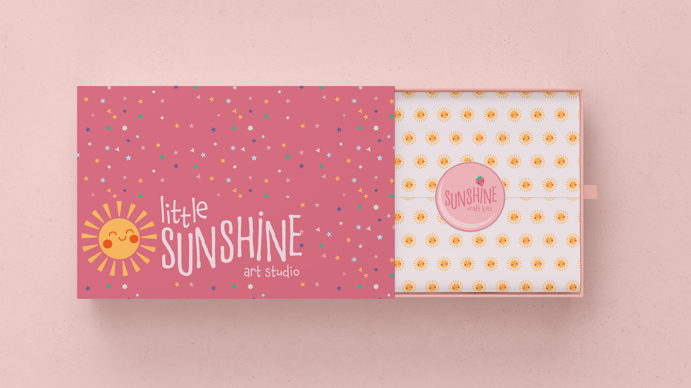
Logo Design: I designed a bold, cheerful logo system featuring a vibrant smiling sun, symbolizing joy, creativity, and warmth. The friendly face and bright colours make the logo instantly recognizable and inviting for young artists. It’s built to be highly adaptable, shining across everything from studio signage to art kits, stickers, and promotional materials, creating a playful and consistent brand presence that kids can connect with and remember.
Colour Palette: I crafted a vibrant palette featuring the colours of the rainbow. These hues evoke joy, creativity, and inclusivity, appearing consistently across signage, materials, and merchandise to establish a warm and welcoming atmosphere.
Typography: I selected a mix of rounded sans-serifs and playful, handwritten-style fonts to reflect a childlike spirit while ensuring clarity and accessibility for both kids and parents. The typography feels friendly, fun, and easy to engage with.
Illustration & Graphic Language: I created a cast of playful, hand-drawn characters to embody the brand’s friendly, approachable spirit. Designed with children in mind, each character is full of personality and charm encouraging imagination, creativity, and connection. These illustrations add a layer of authenticity and expressive energy to the brand.
LITTLE SUNSHINE ART STUDIO KEY INSIGHTS


Little Sunshine Art Studio was such a joy to bring to life. I wanted to create a brand that felt like a warm hug, something that sparks imagination the moment a child walks through the door. Every decision, from the smiling sun logo to the illustrated characters and sunshine-bright palette, was made with real kids and their creativity in mind.
This project allowed me to pour my love for storytelling, playful design, and community-centered branding into one cohesive, vibrant world. It’s a reflection of how I approach design, balancing strategy with heart, and always thinking about how people will feel when they interact with a brand.
Little Sunshine isn’t just about visuals it’s about creating a space where every child feels welcome to explore, express, and just be themselves. And that’s the kind of work I’m most proud to create.