thistle spirits & provisions
Where Botanicals Meet Bold Flavors
Thistle is a brand identity designed for a fictional restaurant rooted in the world of wild botanicals. Drawing inspiration from old-world herbal apothecaries and modern plant-based wellness culture, Thistle offers more than just a meal it offers an immersive, sensory experience.
The visual direction of the brand is steeped in the textures and tones of the natural world. Earthy greens, muted lavenders, soft creams, and deep browns create a grounded yet elegant palette, evoking both the mystery and beauty of the forest floor and blooming meadows.
Thistle’s brand extends seamlessly across multiple touchpoints, including restaurant packaging, menus, signage, and takeaway items. Every design decision works together to communicate a narrative of slow living and ritual.
This project highlights my ability to create a restaurant brand identity system that’s both visually compelling and conceptually cohesive.
Highlighted Skills: Brand Identity Design, Colour Theory, Menu & Print Collateral, Packaging Design and Visual Storytelling

THISTLE SPIRITS & PROVISIONS KEY INSIGHTS
Concept: I developed a refined brand identity inspired by the natural world, blending botanical elegance with earthy sophistication. The design draws from herbs, wildflowers, and apothecary influences, while rich textures and muted palettes elevate the experience to feel curated and timeless.
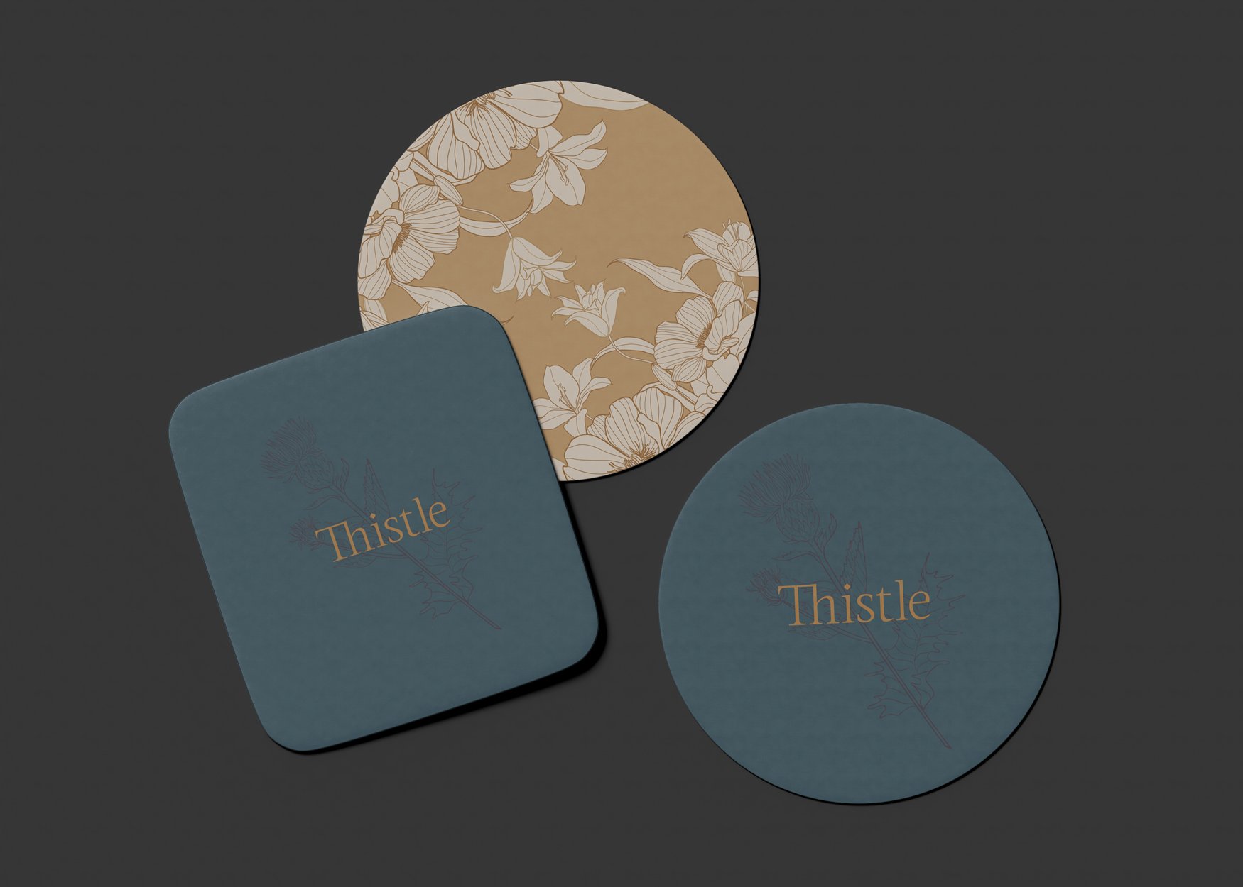
Visual Identity: I crafted a visual system that balances modern apothecary charm with moody romanticism. Delicate floral illustrations, amber glass accents, and clean layouts come together with vintage-inspired serif typography to create an immersive brand.
Colour Palette: I built a deep, nature-inspired palette that included forest greens, warm neutrals, aged brass, and plum tones, layered with organic textures like stone, linen, and wood to establish a grounded atmosphere.
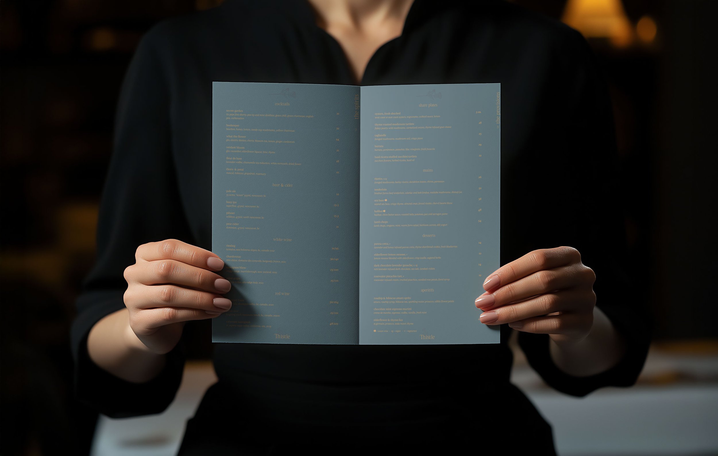
Menu & Seasonal Storytelling: I designed a menu system and visual identity that evolves with the seasons. From subtle shifts in botanical motifs to seasonal ingredients and color accents, every element reinforces Thistle’s ingredient-first, slow-living philosophy.
Brand Cohesion: I unified all brand elements through a consistent tone that feels elevated, earthy, and immersive. Every touchpoint, from printed menus to the take away packaging, works together to express Thistle’s unique position as a modern apothecary cocktail experience.


Thistle is a study in branding. It feel like a place where nature, ritual, and refined design meet. Every visual and tactile choice is rooted in storytelling, creating a brand experience that feels timeless, grounded, and luxurious.
Through this project, I explored how branding can be sensorial, seasonal, and immersive—telling a layered story that invites guests not just to dine, but to slow down, savor, and connect with the natural world in a meaningful, beautifully designed space.
